Investing in the Future of European Security
- Expeditions
- Poland
- United Kingdom
- Defence Fund
- Deep Tech Fund
- Brand Identity
- Brand Strategy
- Website
- Digital Design
Strategy
Expeditions operates in a complex and highly specialised field, speaking to founders, investors, policy-adjacent audiences and security professionals at the same time. The challenge was to make that world feel clear without losing its depth.
The refresh refined Expeditions’ visual identity into a more precise and confident expression. The aim was to create a presence that felt institutional, but not generic. Serious, but not static. Built for a category where trust, speed and technical understanding all matter.
Design
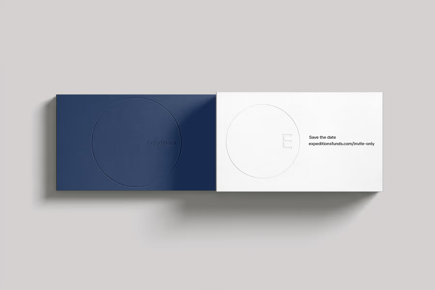
The identity refresh centred around a new logo system: Expeditions set within a gradient circle. The mark symbolises movement, orbit and strategic direction that reflects the fund’s leading role in navigating emerging technologies that shape the future of European security.
We paired this with a restrained visual language and a simplified website designed to communicate the fund’s focus with greater clarity. The result is a sharper, more confident digital presence built around conviction, precision and long-term vision.
Result
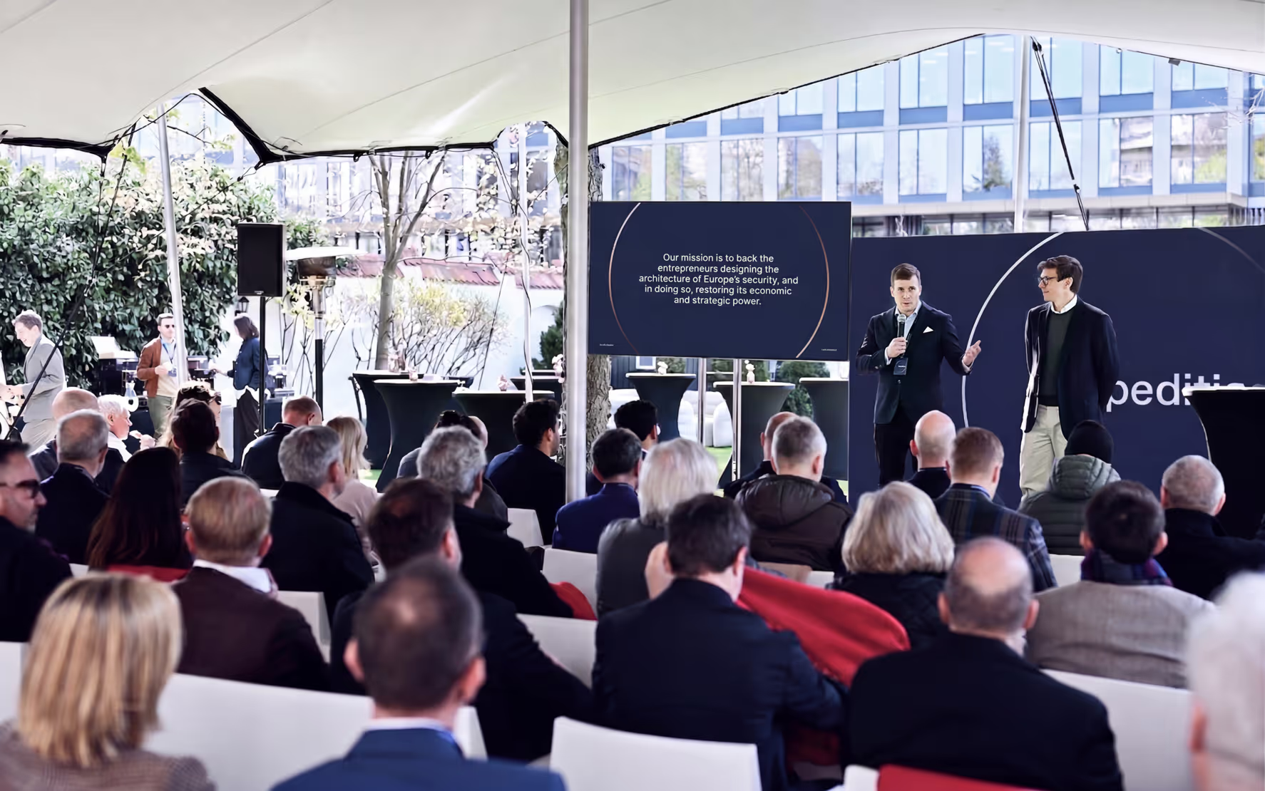
The refreshed identity and website give Expeditions a sharper public presence at a critical moment for European security and defence innovation.
The work focused on creating a clearer narrative for the fund: one that communicates its conviction, sector expertise and long-term role in shaping Europe’s security ecosystem. Across the identity and website, Expeditions now presents a more focused and recognisable position for founders, investors and partners operating in complex, high-stakes markets.