
Clarifying water solutions
Designed for
- Norlex
Country
- Denmark
Area of business
- Water Purification, Cleantech
Provided with
- Brand Identity
- Brand Strategy
- Naming
Details
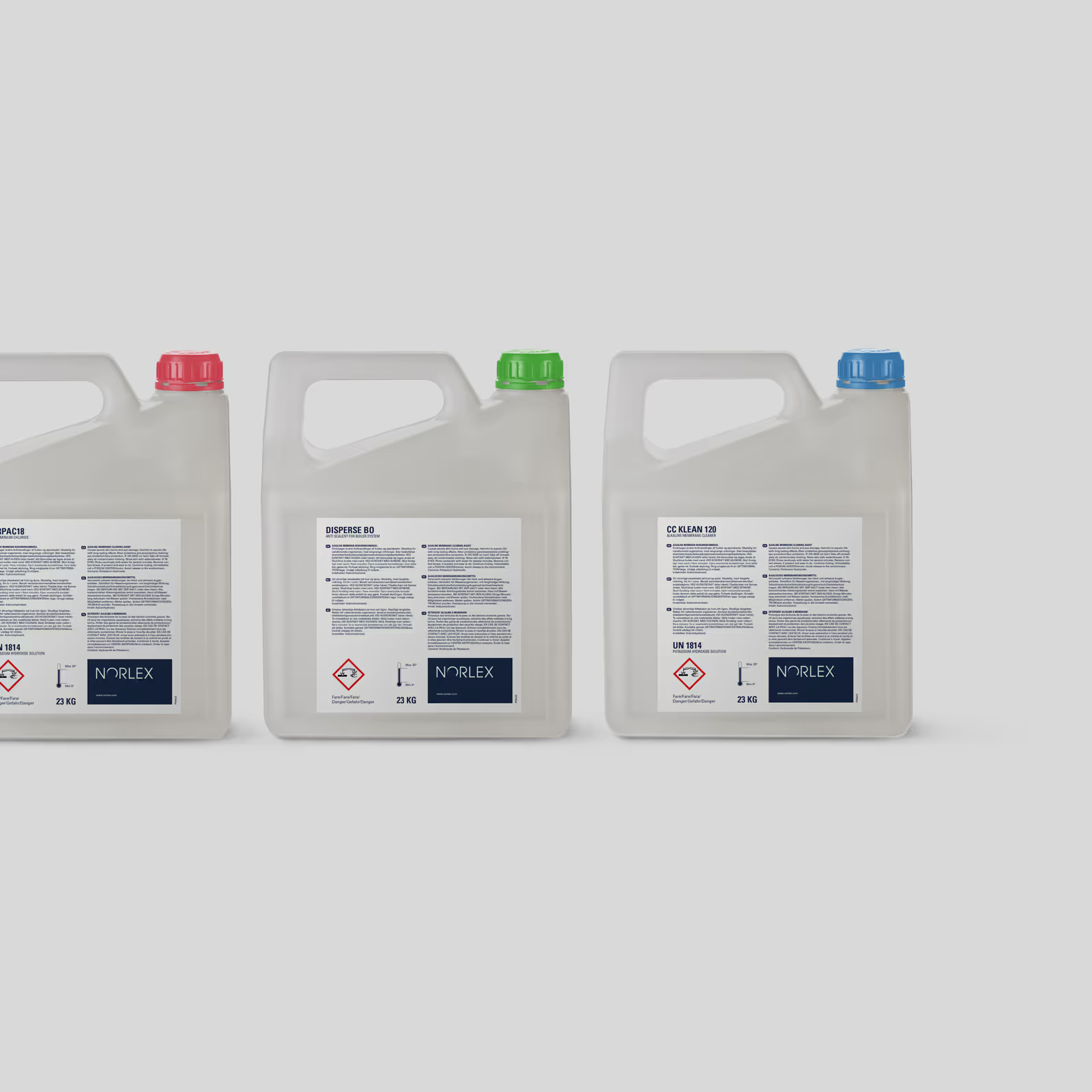
Norlex, a leading Nordic producer in the water treatment industry, offers a comprehensive range of solutions including chemistry, technology, and complete systems for water and wastewater treatment.
Strategy
Formed from a merger between two industry leaders, Copenhagen Chemicals and Bo Jensen Vandbehandling faced a unique challenge: uniting two distinct companies into a single, cohesive brand.
Design
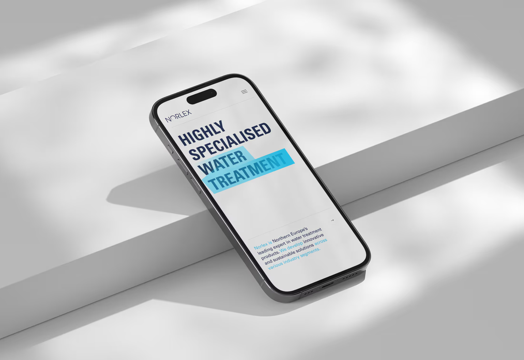
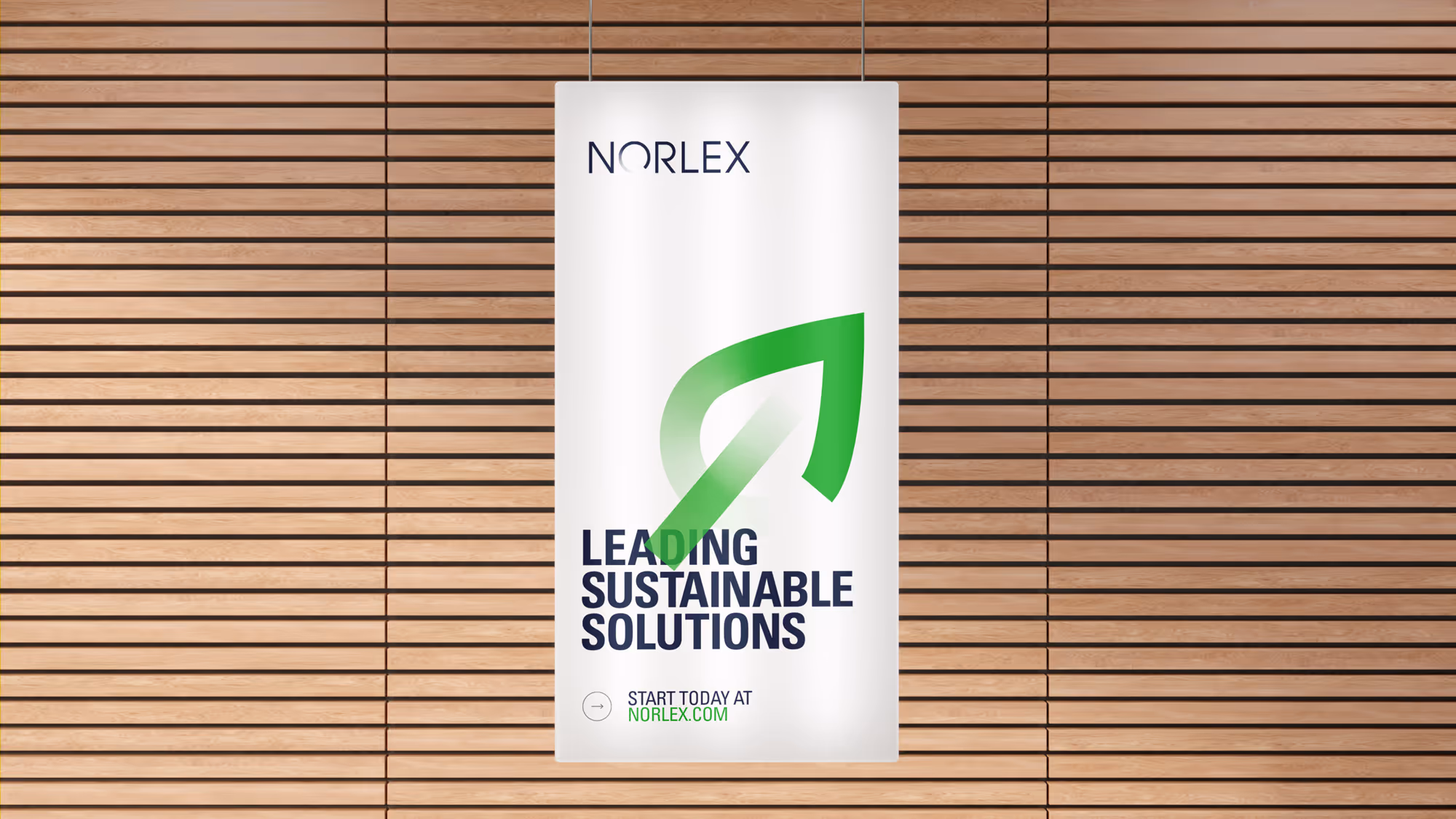
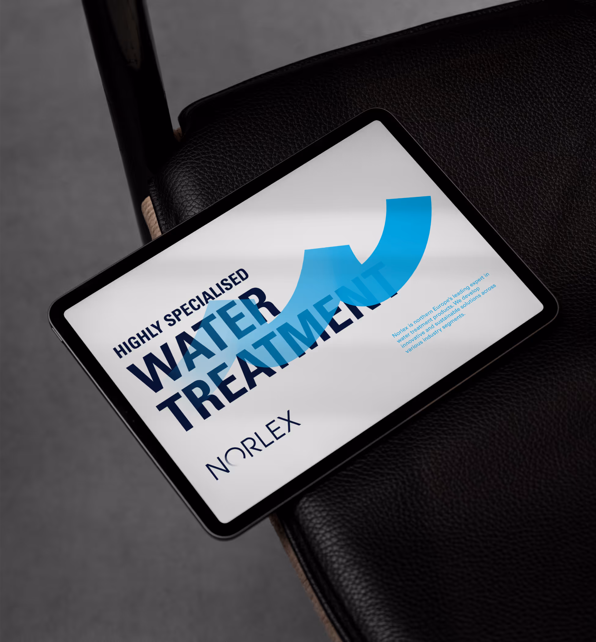
We developed a visual concept using transparent color transitions, that represent purification and clarity.
Further more, HEAVY also developed NORLEX’s brand positioning and name, framing the company as the the go-to expert in specialized water purification and treatment.
Result
The company continued to grow through acquisitions while increasingly focusing on sustainable solutions.
This eventually led to a larger merger that resulted in a name change to Alumichem—a brand we also had the privilege of developing.
Team
Designed by
Robert Daniel Nagy
Designer
Phong Thanh Phan
Designer

Back to Client case overview