Effortless debugging
- Etiq AI
- United Kingdom
- Data Science, AI
- Brand Identity
- Website
- Web Design
- Web Development
- Product UI Design
Etiq AI brought on Commplicated to rebrand and update their messaging and design language to make them stand out from the rest of the AI crowd.
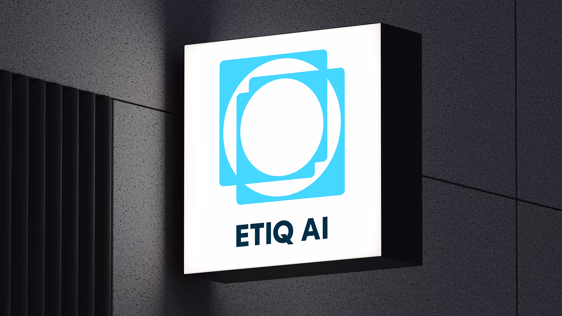
The visual identity for Etiq AI is built around a sense of clarity and ease of mind. The direction takes cues from open skies, distant horizons, and calm, snow-covered peaks. This idea of elevation and perspective became the anchor for the system, reflecting Etiq’s goal of making complex debugging feel lighter and more accessible.
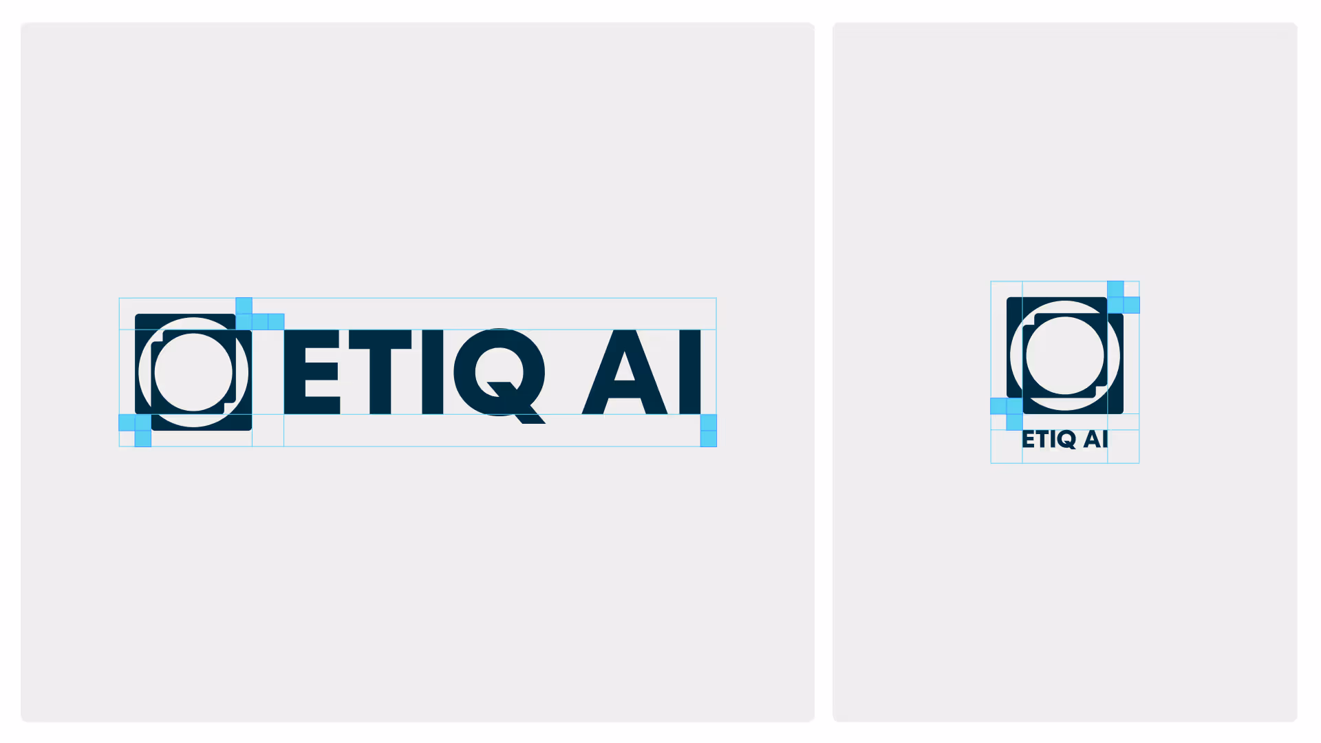
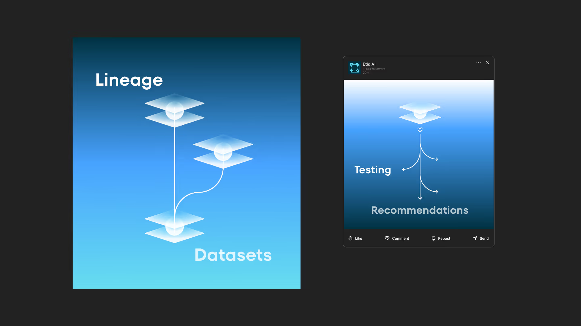
The logo is derived from Etiq’s lineage-based debugging process, moving from complexity toward clarity. The form suggests iteration and gradual reduction, mirroring the flow of the product itself. From this foundation, we developed a flexible design system. A bright yet airy color palette balances energy with calm, while generous whitespace creates focus and visual breathing room. Typography was chosen for its legibility and quiet authority. Like the product, the identity is supportive and non-intrusive: present when needed, and restrained when not.
Etiq AI launched with a visual identity that clearly reflects the product’s purpose and tone. The new system is applied consistently across product, website, and internal materials, giving the team a coherent visual framework as they build and evolve the platform.
The website presents the product with greater clarity and focus, differentiating Etiq within a crowded AI landscape and supporting ongoing enterprise conversations, including trials with large organizations.